EigeninitiativeGeoportal · GIS · Self-initiated2026
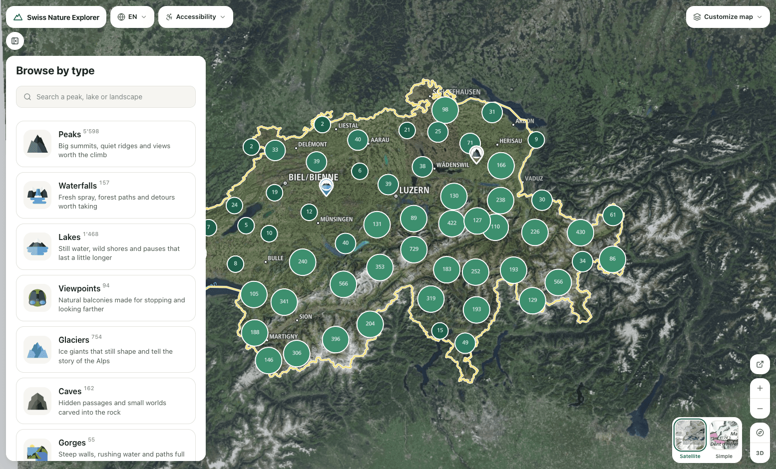
The federal government publishes every peak, lake and protected area. What was missing is the way through. On our own initiative we built it: 8,373 natural places on a four-language map, made for the thumb, drawn entirely from official geodata.
Tags
UX/UI DesignGIS & cartographyPrototyping
The data was there. The way through was not.
The federal government publishes the geodata in full: swisstopo names every peak and mountain lake in swissNAMES3D, BAFU maintains protected areas and the BLN federal inventory, ASTRA the hiking network. What is missing is the application that turns it into orientation. We built it: 8,373 named natural places, clustered on a vector map, drawn entirely from official sources, in four languages.
The value of open government data appears on the way to the answer. The database alone does not deliver it.
The scope
- 8,373
- natural places, clustered
- 4
- official languages, build-enforced
- 100%
- official federal data
- 0
- licence cost per map view
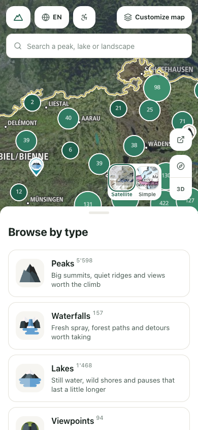
On the phone the map runs edge to edge, with one sheet over it at three heights: a peek, a half, nearly full. The sheet is the navigation and is never dismissed.
- 01Search floats as a pill within thumb reach.
- 02Map controls travel with the sheet's edge.
- 03Its closed state is a look at the map, not an empty screen.
A camera that knows what covers it
Every camera move computes the free viewport from the current occlusion by sheet or sidebar and frames the target in what remains, via fitBounds. The padding is clamped to the canvas, so a request can never ask for more room than the screen has. Distance sets the pace: a place already on screen gets a 450 ms ease, a place beyond the edge a 900 ms flyTo. Touch has its own rules: zoom by pinch only, 3D pitch on an explicit, reversible control, and a 22-pixel hit tolerance, because a fingertip is blunter than a cursor.
From satellite to 3D terrain
One control tilts the map from the flat overhead view into pitched 3D terrain. The elevation model gives the mountains their shape, the state is reversible at any time, and the interaction stays bound to a deliberate action.
Accessibility as structure
For public-sector applications, accessibility is a legal requirement (BehiG, aligned with WCAG). Here it is solved structurally: reduced motion is a switch in the interface that composes with the operating-system setting; a second switch raises the contrast of secondary text over satellite imagery. Controls meet a 44-pixel target size, lists and categories carry a roving tabindex for arrow-key navigation, search is a true ARIA combobox with live announcements, a skip link leads past the results, and every map feature carries a spoken label. All strings ship in DE, FR, IT and EN; a missing translation fails the build rather than falling back in silence.
To a place in seconds
Search or browse by type, one place, one detail. Results arrive in sequence, staggered across the first six cards, and the map keeps its context. In the detail view, dragging the photograph sideways walks through the results in list order.
What this means for a geoportal
- 01
Open government data earns its value through access. The government holds the data; the benefit appears in the application.
- 02
Mobile first means one hand, one thumb. A navigation that never disappears beats menus you have to find.
- 03
Accessibility belongs in the interface, not in the fine print of the operating system.
- 04
A shared state in the URL makes any view quotable and shareable, for the administration and the public alike.
Architecture and result
One codebase, two layouts at the 768-pixel line: above it a sidebar beside the map, below it a map with a gestural sheet. The full map state is encoded in the URL, so any view is deep-linkable, shareable and reproducible as a reference. Built with Next.js, React, MapLibre GL, Tailwind CSS, Framer Motion and Vaul.
«We did not reinvent a database. We made the way to a place short enough that the map makes you want to explore.»
 Luca Fanoni · Senior UX/UI Designer at mindnow
Tech stack
Frontend
Next.js / ReactMaps
MapLibre GLMotion
Framer Motion / VaulData
swisstopo · BAFU · ASTRANext project
Grossen Invest
Premium Presence Without a Rebuild