All projects
Premium Presence Without a Rebuild
Grossen InvestFamily Office · Real Estate & Investments2025
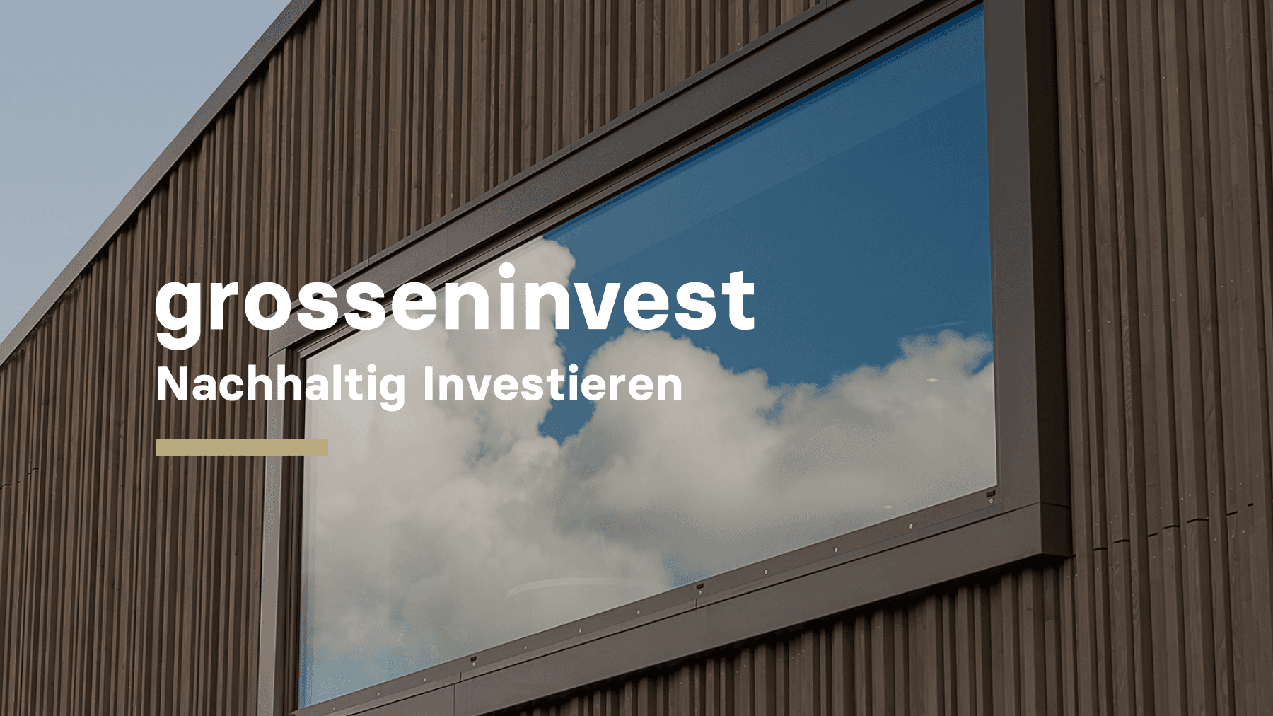
An independent Swiss investment office. In two iterations and four working days: a new visual language, sharper interaction, a new first impression — without a rebuild.
Tags
WebsiteBranding
Premium Presence for Grossen Invest, Without a Rebuild
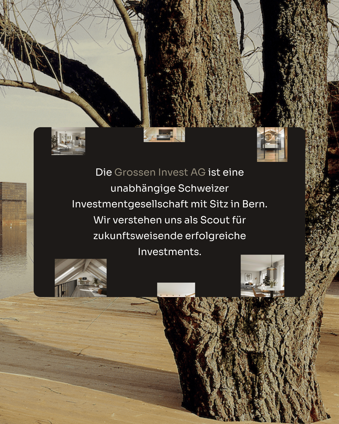
Grossen Invest is an independent Swiss investment office with a proven track record, a strong network and a clear multi-vertical strategy. The gap between this organisational quality and its digital presence was the brief.
Across two focused iterations and a total of four working days, we redefined the visual language, sharpened the quality of interaction and rebuilt the first impression. Without touching the existing structure and without backend development.
In Our Client’s Words
Why was a change needed? Our website felt generic. It communicated neither our strength nor our track record or the ecosystem we had built. It was there, but it wasn’t working.
What was it like working with Mindnow? Fast and focused. The team immediately understood what we needed; decisions were made in real time, without unnecessarily complicating the scope or implementation.
What has changed now? We can position ourselves more precisely and attract the right partners and opportunities. Thanks to the CMS, we have full control over our content.
«Nothing was missing from the content, but the first five seconds were weak. And digitally, those five seconds decide everything.»
 Patti Habarta · Head and VP of Design at Mindnow
Same Structure, New Presence
No rebuild. No CMS migration. The same underlying structure, now with a visual language, typographic system and level of interaction that matches the organisation behind it.
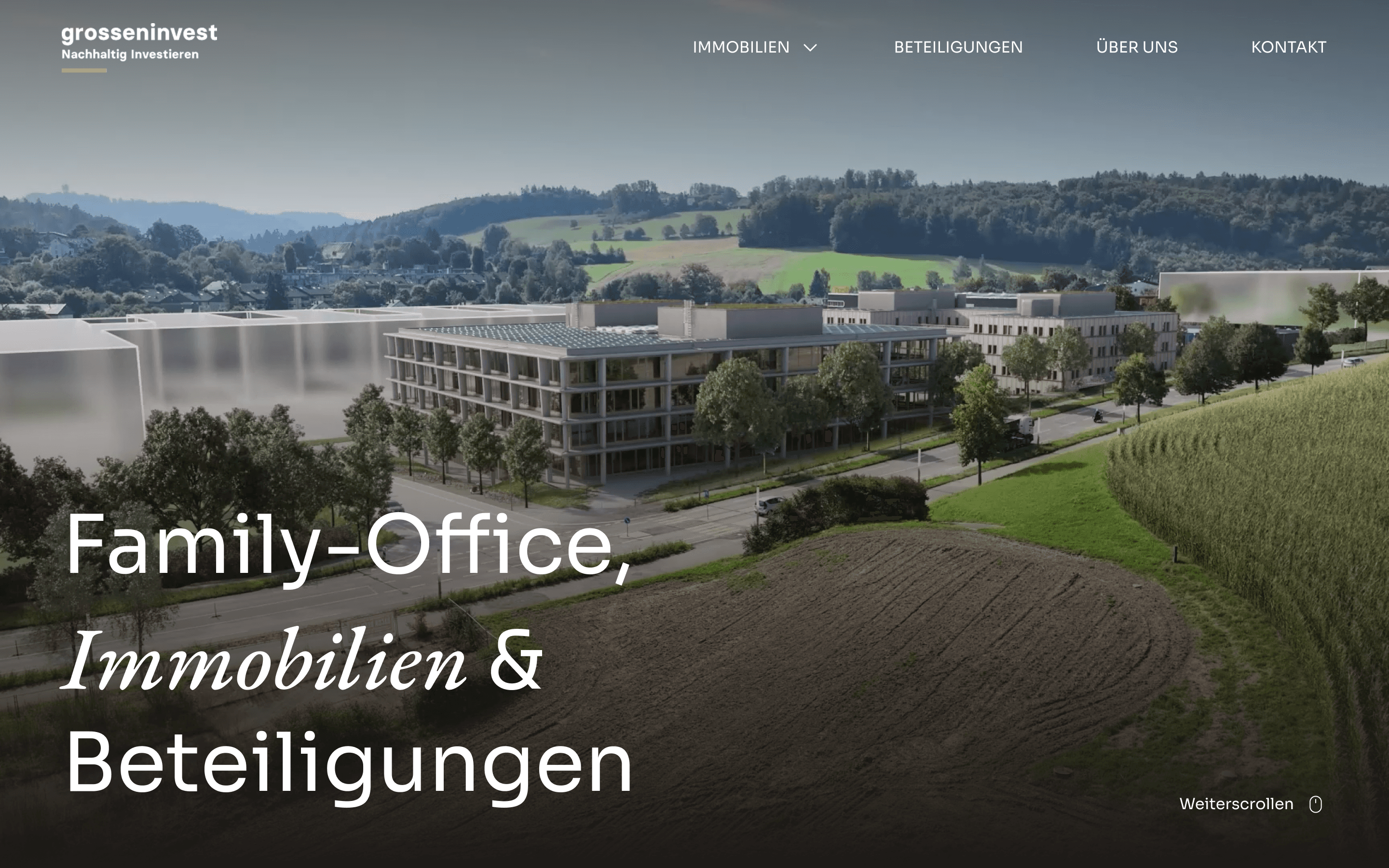 After
After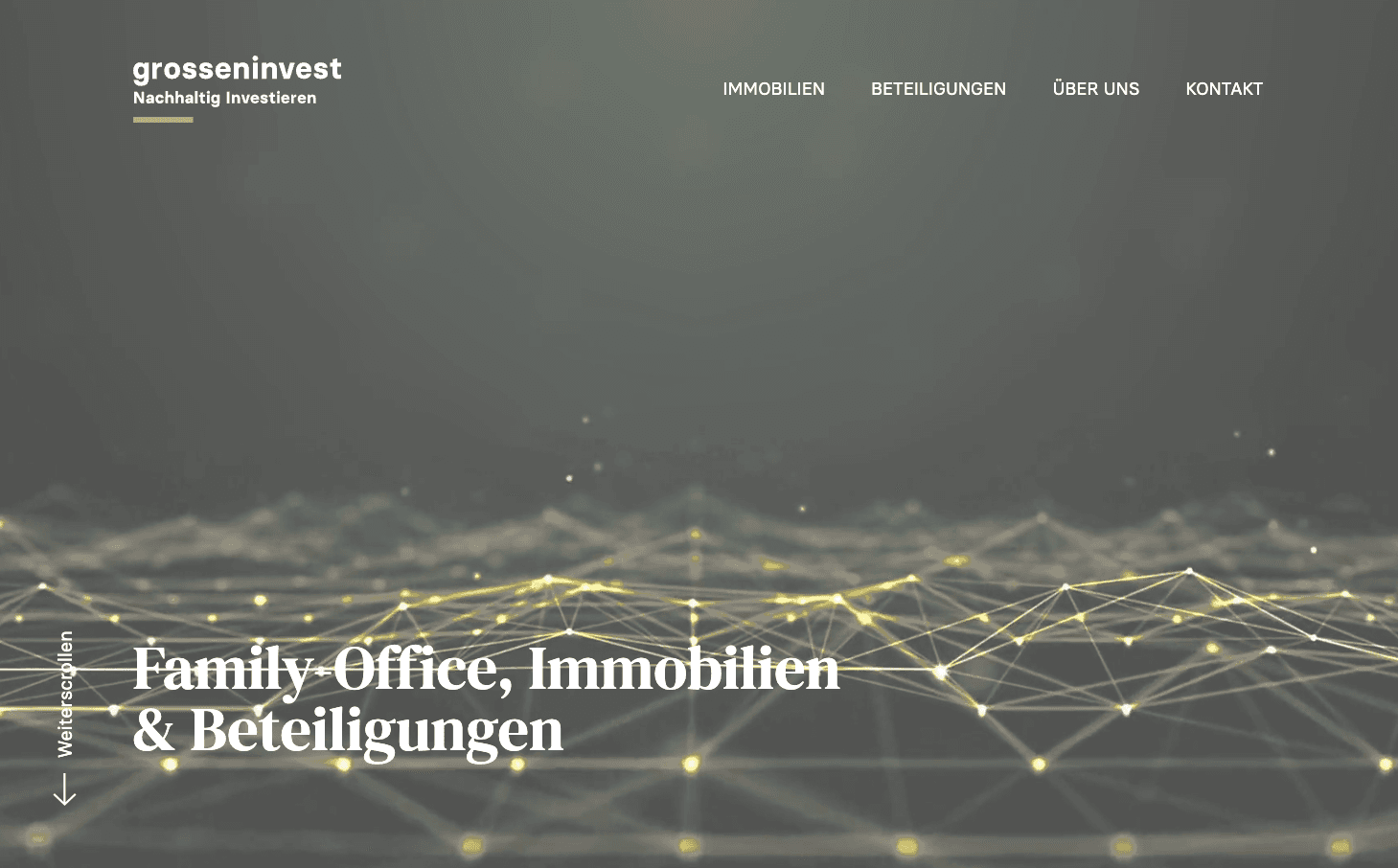 Before
Brief & Insights
The brief set the direction without prescribing the solution. Our client knew the site wasn’t working. But diagnosing why — and deciding exactly what needed to change — was the real work.
Building trust: In investment, credibility is established before the first conversation begins. Visual language, typographic consistency and interaction quality signal attention to detail before a single word is read.
Redesign without risk: The most effective digital interventions are not always the biggest. Knowing exactly where perception breaks down and addressing only those points is itself a strategic capability.
A Visual Language That Builds Trust
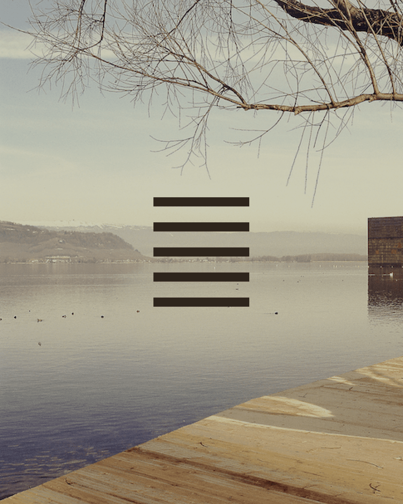
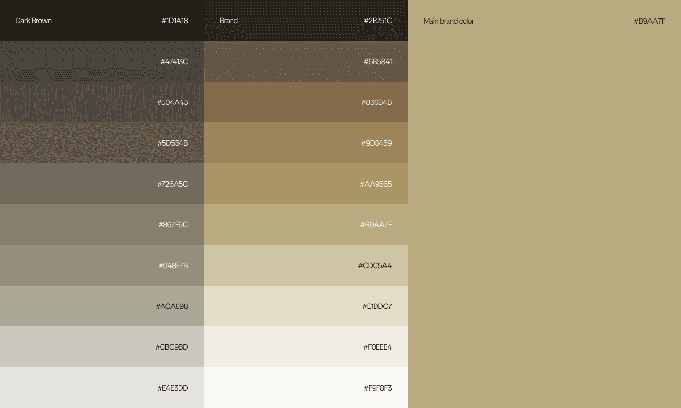
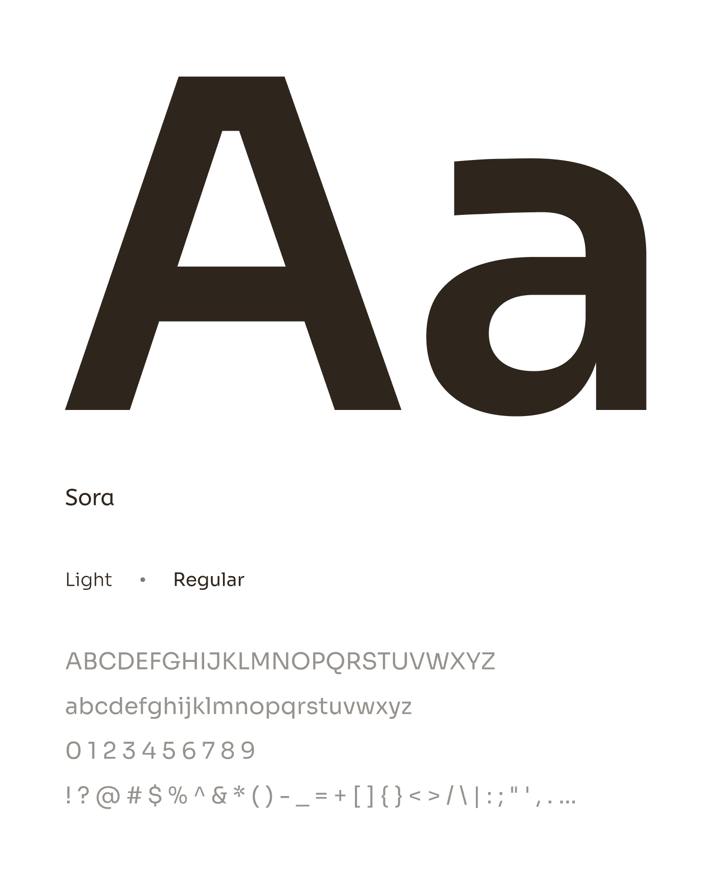
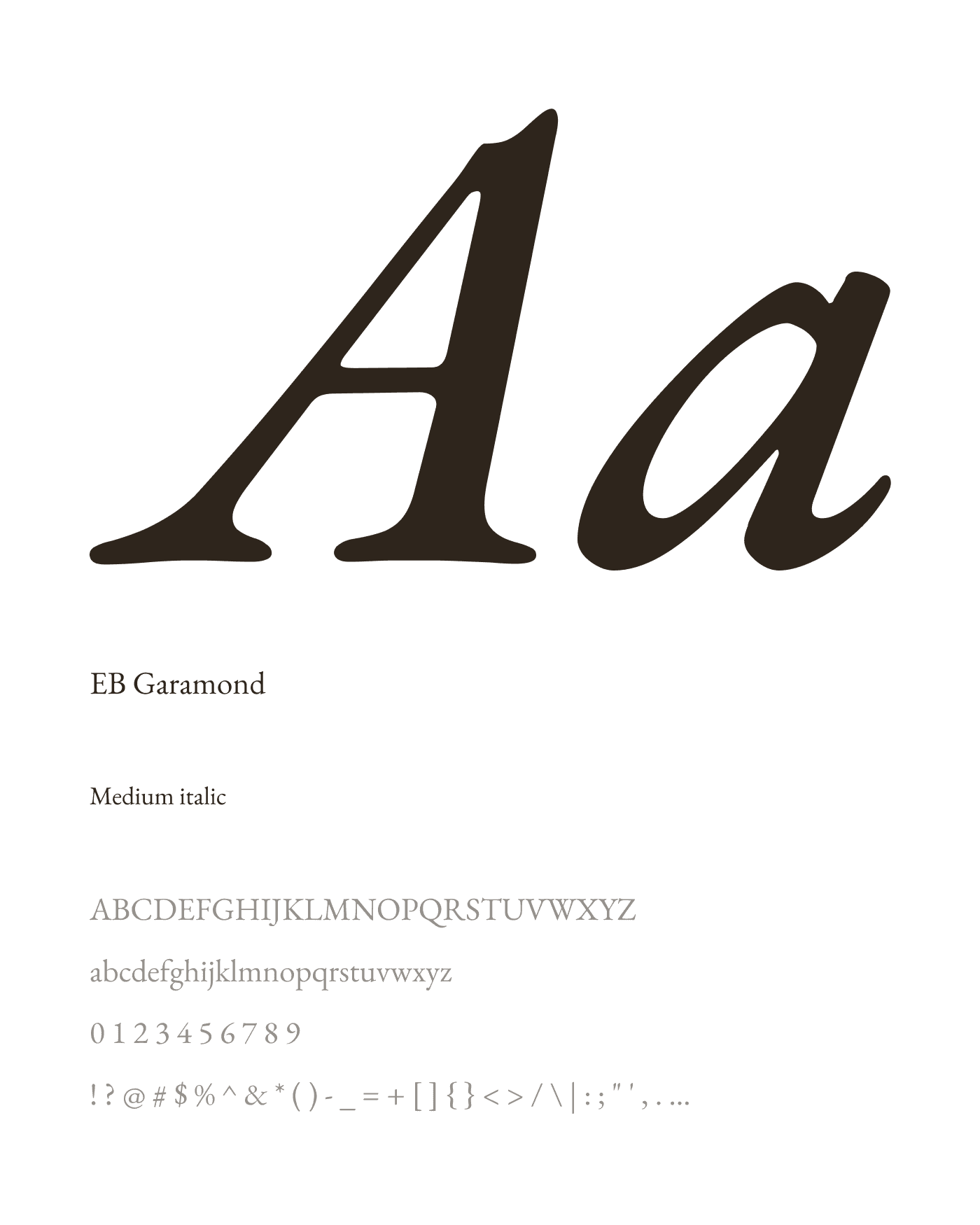
A two-typeface system: a geometric sans serif for clarity and a classic serif for authority, combined with a warm, dark palette of brown, black and gold.
An Identity That Works at Every Scale
From the logo lock-up to full-page compositions, the visual system remains coherent. The brand does not rely on a single hero moment. It builds credibility across every touchpoint a visitor encounters.
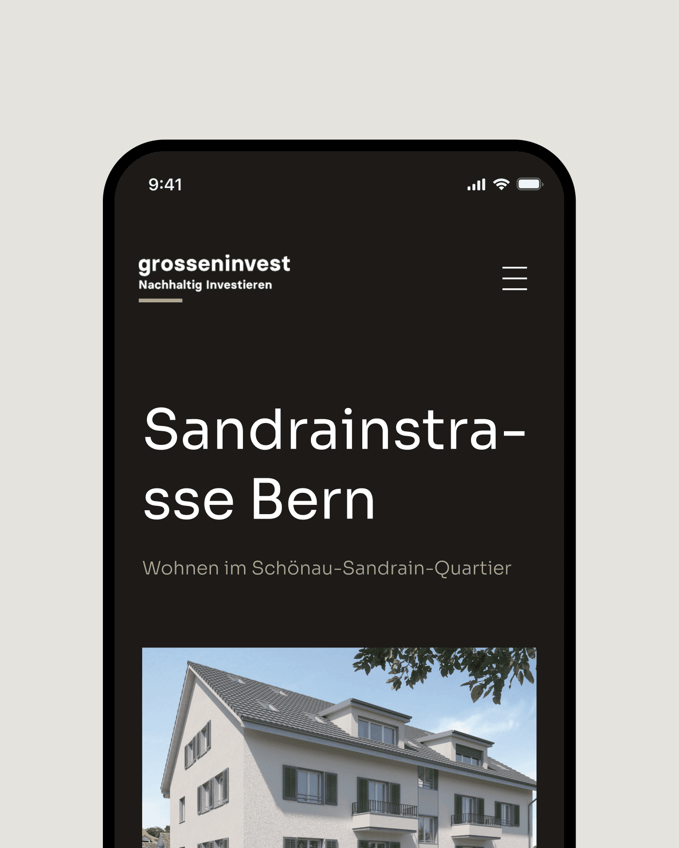
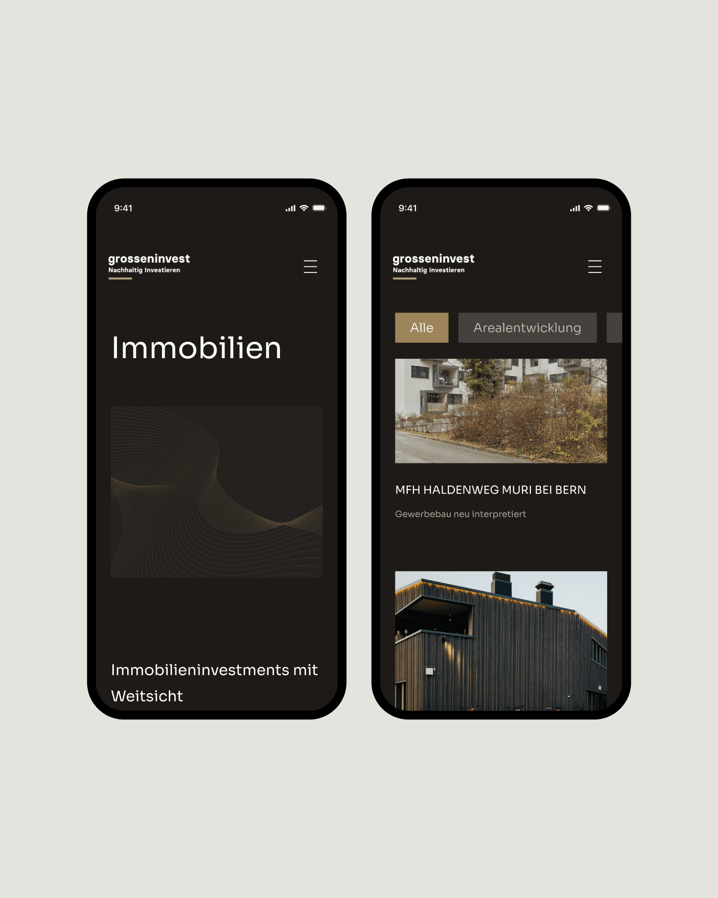
Consistent on Every Device
Animated content sections add momentum to the narrative without becoming distracting. Mobile layouts maintain the same visual hierarchy as desktop: the same weight, the same clarity, the same first impression.
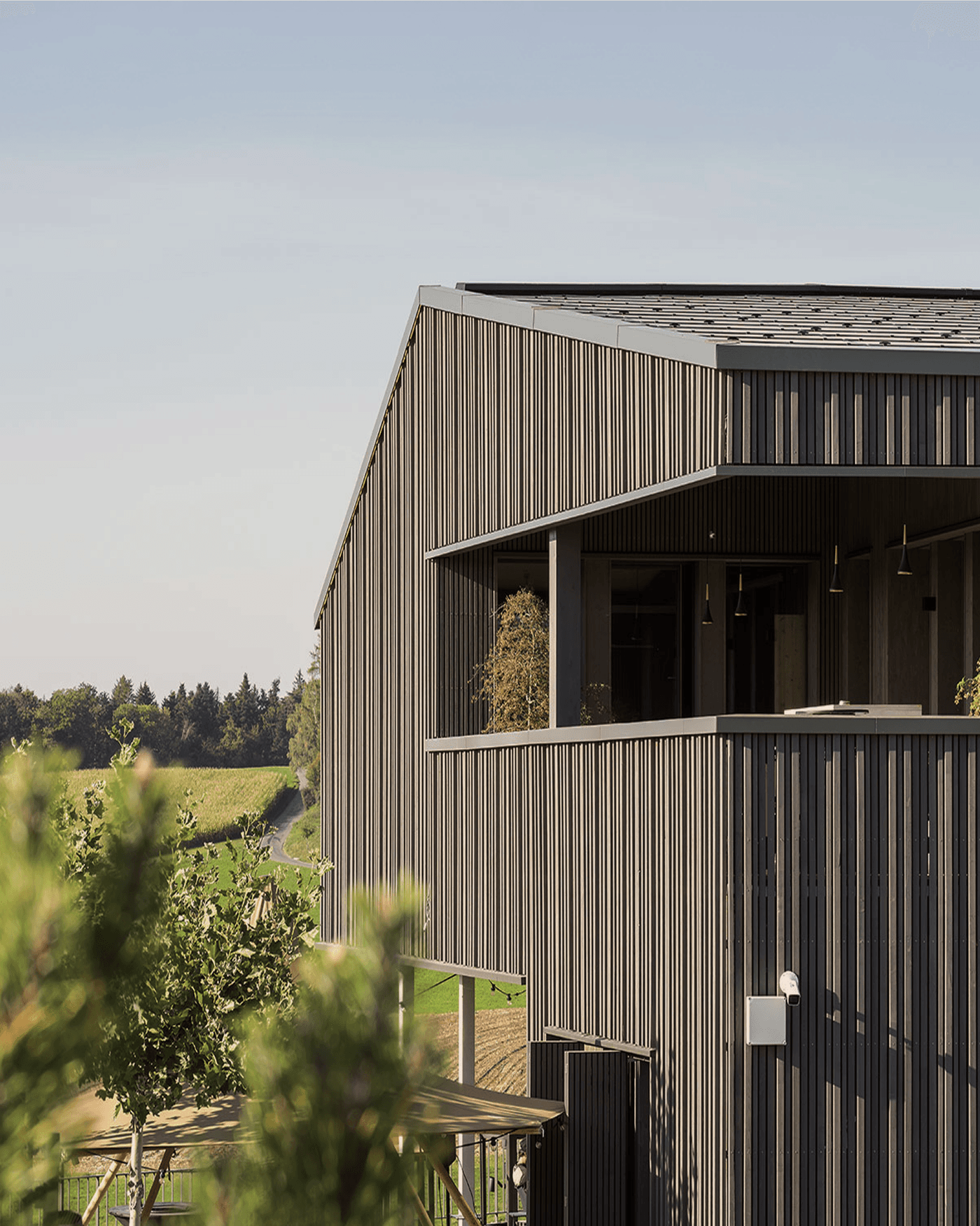
Every Property in Its Best Light
Premium properties deserve a premium presentation. Generous whitespace, full-bleed imagery and a clear typographic hierarchy give every property the visual weight it deserves.
«Now we can tell our story properly and create a much stronger first impression, which is crucial in our environment.»
 Daniel Grossen · CEO & Owner, Grossen Invest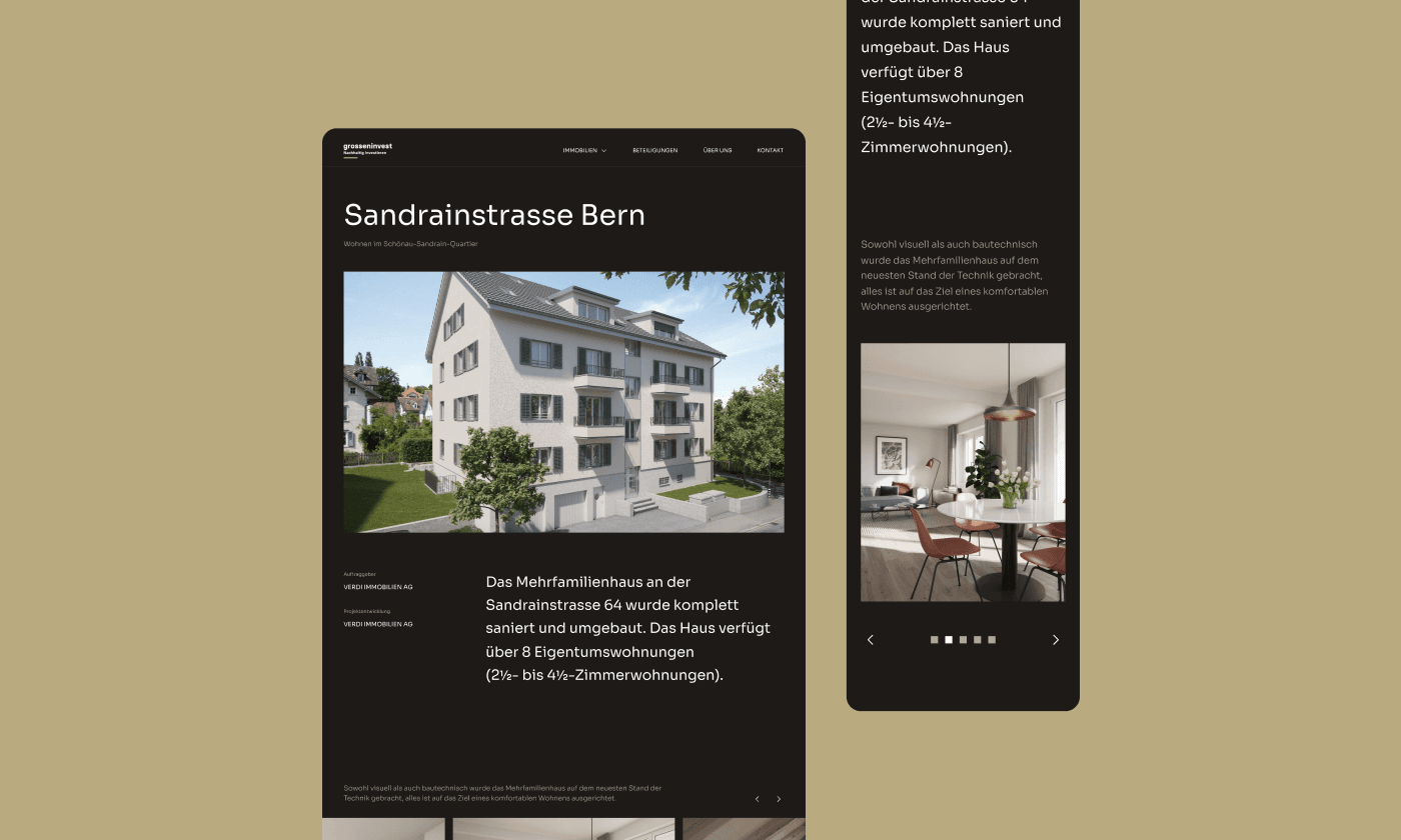
Tech stack
Design
FigmaAnimationen
JitterCMS
WordPressNext project
Club zum Rennweg
The digital platform for an exclusive Zurich private club